Quick Access Guide
This document provides an overview of how to set up and use many of the new user interface tools in Ceres 5. The information in this document is not tied to a particular role center or security role. You may find that your pages may look slightly different. Many of the components defined here are only enabled with the Ceres 5 Windows client. If you are using the Web client, then user-specific page customization is restricted.
::: note The word “customizing” in this document refers to using the base Ceres capabilities to tailor the end user experience and does not involve creating custom code. :::
Ceres Object release 5.00.00 is required for the functionality described in this document.
Shortcut Keys Reference
Below are some of the most commonly used shortcut keys. Shortcut keys are displayed on each menu, next to the application menu item.
| Role Tailored Client Shortcut Key | Description |
|---|---|
| F1 | Online NAV Help |
| Ctrl +N | New or (insert) |
| Ctrl + DEL | Delete |
| Alt + Down Arrow | Open drop-down on fields |
| F5 | Refresh the Page |
| F7 | Open Statistics on Card Pages |
| F8 | Copies values from the line above |
| F9 | Post |
| Shift + F9 | Post and Print |
Page Elements
Address Bar
The Address Bar includes:
-
Back/Forward button – Moves you sequentially from Page to Page
-
Travel History (blue drop-down arrow) – Lists all Pages visited recently
-
Navigation path (hierarchical context) – You can move up or down the path using the arrows or by clicking an entry in the path
-
Refresh (F5) – To update/refresh the Page you are on
-
Search field – System will look for matches to the Page Name as you type. Use the icons and navigation path displayed in the search results to help you choose which Page to select.
Command Bar
The Dynamics NAV button (blue drop-down arrow) lets you Set Work Date, Select Language, Select Server, or Select Company. You can also Exit the database from this button.

Other Command Bar features are:
-
Ribbon Bar Tabs – Some tabs are not displayed on a Page if they do not apply.
-
Home – Contains the most often used functions for this page. Through page customization you may promote or demote actions to/from the Home tab.
-
Actions – Action type options associated with the Page, such as View, Edit, or New functions
-
Navigate – All other information associated with Page, such as Dimensions, etc.
-
Report – Any report associated with the Page

-
From the Command Bar Drop Down you can access the following features:
-
Page
-
Open in New Window
-
Copy Link to Page
-
-
Print & Send
-
Email as Attachment
-
Send to Microsoft Word
-
Send to Microsoft Excel
-
Print Page
-
-
Customize
-
Filter Pane
-
FactBox Pane
-
Choose Columns…
-
Choose FactBoxes…
-
Customize Ribbon…
-
Customize Chart…
-
Customize This Page…
-
Customize Navigation Pane…
-
-
Help
-
Microsoft Dynamics NAV Help (F1) – Provide access to the base NAV Online Help, information about the current Page, and the Help About screen. Please refer to the procedure documents for Ceres-specific Help.
-
About This Page
-
About Microsoft Dynamics NAV
-
-
Ribbon Bar
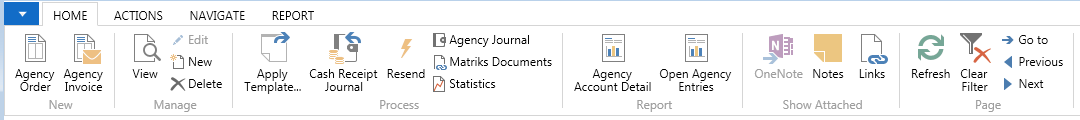
A Ribbon Bar:
-
Can include New, Manage, Process, Report, Show Attached and Page sections.
-
Tasks can be promoted to the Home Ribbon to allow you quick access to what you frequently use.
-
Most options shown are available from the Command bar menus; however, you will find some instances where links have been added to tasks elsewhere in Ceres.
Status Bar
The Status Bar includes:
-
Company button – Displays the Company you are currently working in. You can change the Company by clicking on the Company Name.
-
Work Date button – Displays the current work date. You can change the work date by clicking on the date field.
-
User – Display the ID of the user who is logged on.
Navigation Pane
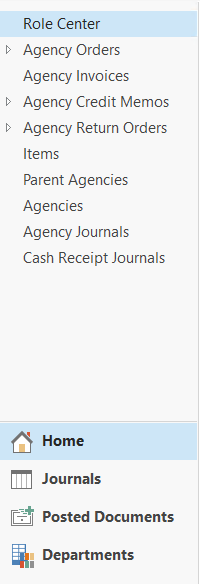
The Navigation Pane includes:
-
Activity buttons – Home and Departments. You can also add your own Activity buttons (see Customization section).
-
Menu Items
-
Home – Defined as part of the Role Center you are assigned
-
Journals – Defined as part of the Role Center you are assigned
-
Posted Documents – Defined as part of the Role Center you are assigned
-
Departments – Displays the options or sub menus under each Department
-
Vertical and horizontal resizing controls – Available both within the Navigation Pane and Content Area.
Pages – Home vs. Departments
Pages listed in the Home Navigation Pane can also be found under the applicable Department. These represent two separate instances of the same Page.
For example, if you type Vendors in the Search field, two or more items display. Vendors can be accessed from the Home Page or from Departments. The system maintains separate settings for customizations.

If you click on the Vendors menu item, the system will display the Vendor List Page with the content area. Not all pages are displayed with the content area; some are modal in that the page displays as an additional item in your Windows Task Bar.
Content Area
This area displays content based on the selected menu item. If you click on Role Center, any content that is linked to your Role Center displays. The content changes based on which Role Center is assigned and any personalization that has been made.

Page Types
Departments Page

On Department Pages:
-
Each department (also called a module) is displayed in the content area when you select Departments from the Navigation Pane.
-
The Financial Management menu has departments underneath it. You can navigate to a page using Choose by Department or choose by Category.
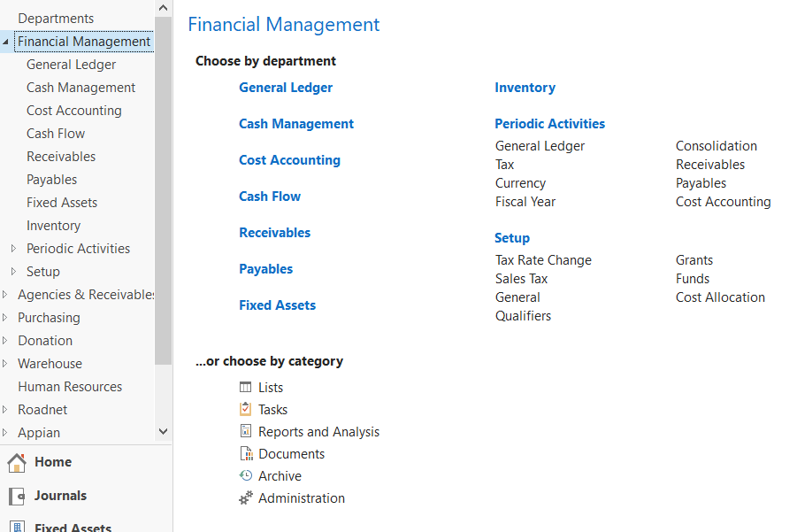
- The categories are defined by the system and every menu item in Ceres is assigned one of these categories, which has a unique icon display in the Search results.

List Page

Within each Page there may be a:
-
Ribbon Bar – Actions, Navigate, and Report menus and New, Manage, Process, and Report areas of each menu (see Page Elements for more details)
-
FactBox Pane (displays to the right of the List)
-
Can include data-related facts about a specific record. Not defined for all List Pages in Ceres
-
Can include Links and/or Notes
-
Always displays below any data-related FactBoxes
-
Links and Notes are entered from the Card Page
-
Links can be opened from the List Page
-
Notes can be viewed from the List Page
-
Filter Pane
-
Basic filtering: Input a value in the Type to filter field. You can change the field you want to filter by clicking on the down arrow to the right of the No. field. The fields that display in the drop down are the same fields that display on the List Page.

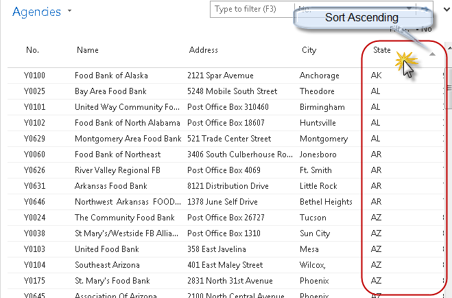
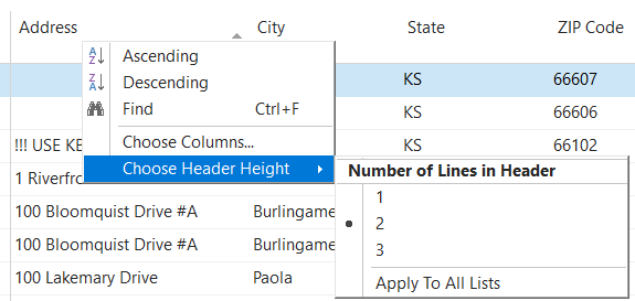
- Basic Sorting: Sorting is accomplished by clicking on the column you wish to sort by. Clicking that column again toggles between Ascending and Descending sort.
-
Page Title button – Includes filtering options, as well as the option to Save View As…
-
Advanced filtering: Click Page Title button to the right of the Agencies field and place a check mark by the Advanced filter and Limit totals fields.

- In the Show Results section select the fields and the values you want to filter by.

- Click on the down arrow to the right of any one of the filter fields and select All for a list of additional fields you can filter by. Scroll down or type the first letter of the field until you find the field you want to filter by. Please note that the fields in the drop-down lists are in alphabetical order.
- In the Limit totals to: section select the fields and values you want to filter. Limit totals to filters are the equivalent of flow filters in earlier versions of Ceres. You can use Limit totals to filters independently or in conjunction with Show results filters.

-
You can use filter shortcuts:
-
* (asterisk) works as a wild card, e.g., No. = B* returns all values that start with the letter “B”).
-
.. (period period) works as a range, e.g., No. = B0100..B0500 returns all numbers between and including B0100 and B0500.
-
| (pipe) works as an “OR”, e.g., B0129|B0458 returns just B0129 and B0458.
See the Ceres Filter Criteria document for a more comprehensive list.
-
-
Once you have set your filters, you can save the view by selecting Save View As. In the Name field, input the name of your view and then click the OK button. All saved views appear in the Home Navigation Pane.

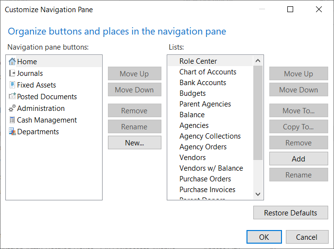
- To delete a saved view, find the view in your Home menu. Right click on it and select Customize Navigation Pane. Once you have found your view in Lists: select Remove and then click the OK button.
Navigation Pane – Customization
To Customize the Navigation Pane, right click in the Navigation Pane and select “Customize Navigation Pane.”
- Column Height. To change the column height on a List, right click on any field and then select Choose Header Height. Select 1, 2, or 3 as the number of lines. Select “Apply To All Lists” to change the height on all List Pages.
-
Choose Columns. To add, remove, or change how columns display, right click on a field in the List and then select Choose Columns. The fields on the left in the Available columns list are the fields that you can add. Whereas the fields on the right in the Show columns in this order are the fields that currently display.
-
Click on the Add >> button to add fields.
-
Click on the Remove << button to remove fields.
-
Click on the Move Up or Move Down buttons to change the order in which the fields display.
-
To make scrolling easier, select Add Freeze Pane to freeze fields on the List
Most Ceres list pages already contain a Freeze Pane.
- To restore the system defaults, click on the Restore Defaults button.

Charts
You can create charts on the fly in a list page. However, the chart settings are not retained when you close Ceres. See Customization section for more information. You can also:
-
Display the chart pane via the Customize Navigation Pane
-
Select two or three elements for the chart
-
Two elements = Two-dimensional chart
-
Three elements = Three-dimensional chart
-
You can use multiple values within one dimension
Customization Options for Other Entities
To customize pages, select the Drop-Down Command button on the command bar and click on Customize.

-
Filter Pane – Allows you to hide or show the Filter Pane on the page.
-
FactBox Pane – Allows you to hide or show the Fact Boxes on the page.
-
Choose Columns… – Allows you to control the order of each field in the list as well as determining which fields are to be displayed.
-
Choose FactBoxes… – Allows you to choose which Fact Boxes are displayed on the page if you are showing fact boxes.
-
Customize Ribbon… – Allows you to customize the command ribbons displayed on this page. You can hide options you do not use, reorganize, and promote your most used functions to the Home section on the ribbon bar.
-
Customize Chart… – Allows you to create and specify the criteria to display a chart on the list data displayed.
-
Customize This Page… – This is an alternative way to access many of the above features from one centralized page.
-
Customize Navigation Pane… – Allows you to add, change or delete options from the menu system.
Card Page
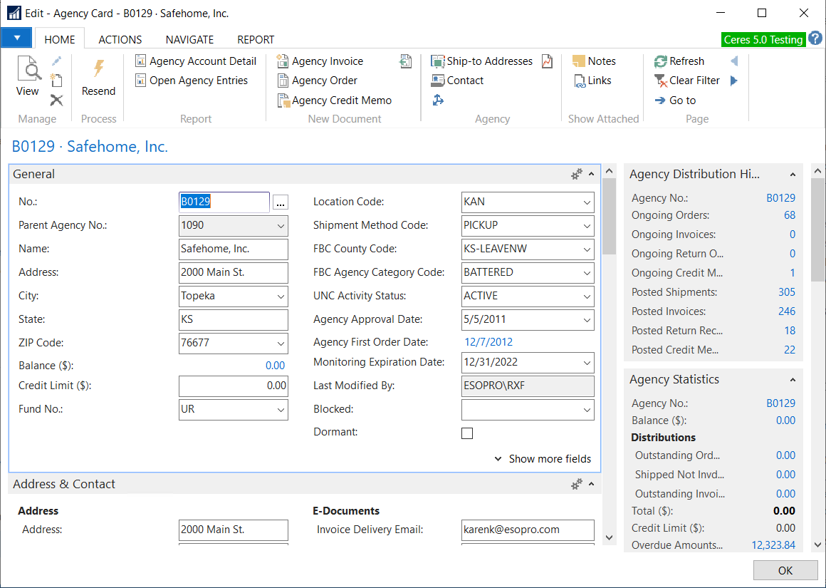
A Card Page can include:
-
Command Bar
-
Ribbon Bar
-
FactBox Pane
-
Notes – You can add notes from the Card Page. You can also notify and send the note to other users to alert them of an action that needs to be taken.

- Links – Allows you to link documents to a specific Page.
FastTabs

-
FastTab
-
Can be opened or collapsed by clicking on the up/down arrow on the right
-
You can add, hide, or remove fields on a FastTab.
-
When a FastTab is collapsed, some field values can display on the FastTab. To display, the field needs to have an Importance Status of Promoted. The options are: Standard = Always display; Additional = Only display when you click on the “Show more fields” button on the FastTab and Promoted = Display the field value when the FastTab is collapsed.
Customization Options
The same customization options listed above apply to Card Pages. Other options that are available are:
-
Re-organize the FastTabs by removing or re-ordering them.
-
Add or remove tasks from the New, Process, or Reports areas of the Action Pane.
-
Create a custom area of the Action Pane.
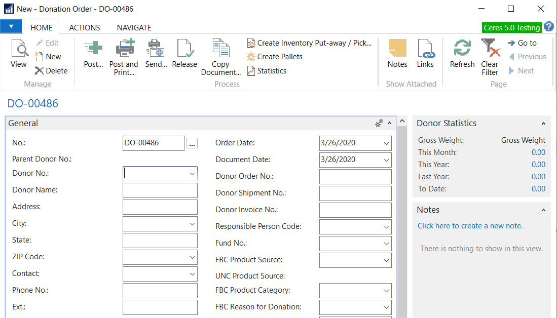
Task Page and Customizing
Typical examples of Task Pages are documents or journals where task are performed. Below is an Agency Order Task Page.

A Task Page can include:
-
Command Bar
-
Ribbon Bar
-
FactBoxes
-
FastTabs – As outlined above you can re-organize the FastTabs and add or remove fields.
-
OK Button
-
There are some Task Pages that allow the user to edit directly and include the OK button on the bottom of the Page. Clicking OK simply saves the edits made to the Page and does not actually process the Page.
-
Other Pages involve actual processing, in which case you must click on that button in the Action Pane or select the function under the Actions menu on the Command Bar.
Analysis Pages with Trendscapes

-
Fields on the General FastTab control the way the matrix is displayed whereas the fields on the Lines FastTab may be different based on the specific page. Common options on the General FastTab are:
-
Show as Lines or Show as Columns
-
View by or View as
-
Rounding Factor
-
Show Column Name
-
When appropriate, there may also be a Filters FastTab to limit the records that display on the Lines FastTab. Common filters are:
-
Date filter
-
G/L Account filter
-
Dimension filters
-
Click Previous Column/Next Column to move the display forward or backward.
-
If you have more than 12 columns, click Previous Set/Next Set to jump the display forward or backward.
Customization Options - Analyis Pages
The same customization options listed above apply to Analysis Pages.
Role Centers
A Role Center can be assigned to each user based on the tasks or roles they perform. There are a number of base Role Centers available in Ceres 5 such as Accounting Manager, Shipping Receiving Manager, Agency Relations, etc. With training, food banks can also tailor the base Role Center components that are assigned to their users as opposed to the users needing to make the changes individually. A default Role Center is assigned to each user and should be reviewed/updated via the User Personalization page.
Navigation Pane - Role Center
-
Content in the Navigation Pane is defined as part of the Role Center definition.
-
Entries in the Navigation Pane open List Pages only.
-
Links to Lists associated with Cues will always be displayed.
Activities Part

-
The Activities Part is not required, but will exist if the Role Center Profile includes any Cues or Links.
-
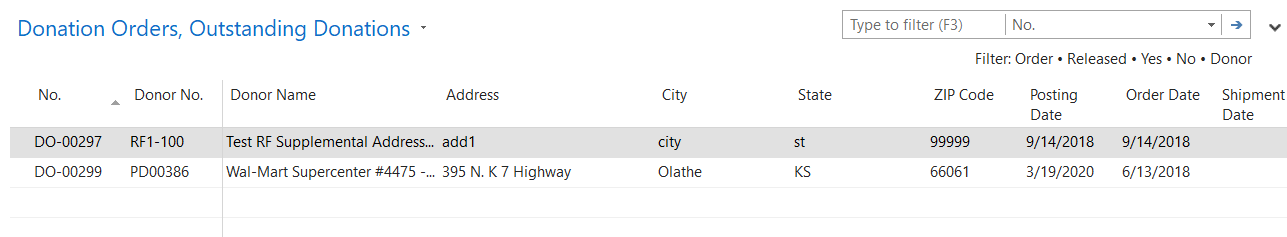
Cue – A Cue is a visual representation, including a record count, of work to be performed. Clicking on the Cue displays the list of the corresponding records in the Content Area. For example, if you click on the Outstanding Donations Cue the following List displays.
- Link – A Link will open the specified Page and are usually reserved for tasks. For example, clicking on the New Donation Order Link will open up a new (blank) Donation Order.

- You can group Cues and Links together under a Header. In the screen shots above, you can see that Agency and Donor/Vendor activities are linked.
My Notifications Part
Notifications display on the Home Page, any notes created via the Notes feature where the users checked the Notify box and indicated a user for the note to be delivered to. The Note here is a link to the task or card that was the source of the note.

-
Entries displayed are user specific.
-
Using the Action menu (gears), you can open the note or open the associated record.
Microsoft Outlook Part
Allows the user to specify whether or not to display their mail, calendar, and tasks within their Role Center. This requires that Outlook and Ceres 5 were configured to communicate during initial setup.

My…Part
Allows the user to display their top or specific records.

-
The following types of records can be displayed in the My…Part section:
-
Agency
-
Donors
-
Vendors
-
Items
-
Records are manually added or removed by clicking on Manage List. Users can then open the specific Card from the Role Center, saving the time of navigating to the List Page and opening it up from there.
Links Part
Links are a way to link documents or files to a specific record. Documents or files are linked to Card or Task Pages and can be displayed on the List Page. From the List Page, the document or file can be opened.

- Links are Role Center specific but are visible by all users assigned to that Role Center.
Customization Options for a Role Center
Just like Pages, each user can customize their Role Center in the Windows client. The components defined in the customization sections of the document actually customize the assigned Role Center for the users. Any of these changes would be lost if the Role Center assigned to the User is changed.
-
Menus – Re-organize the Action or Reports menus, including removing tasks, adding heading text to separate tasks on the menu, or creating groups so that tasks are accessed from the submenu.
-
Navigation Pane – Re-organize the entries on the Navigation Pane. You can also create a custom Activity button.
-
Customize this Page – Allows you to add or hide Parts on the Role Center.
-
Delete Personalization Settings
-
UI Settings – Removes your personal settings.
-
Automation Settings – Settings stored when you click on default buttons on some messages, such as Always Allow.
- File Handling Settings – Settings that are stored when you indicate a program to use for specific file types.
Related Topics
- Ceres Profile Configuration